Trophies of the Domesticate
this was also a still life for the city art association prompt as described below but i procrastinated myself out of time to finish for that. whatever lol itll still be fun to do. i bought sooo many cheap cat toys for this ketchup is delighted. she has a zillion toys already but i had this color palette in mind so whats the harm in more!
.JPEG)
my current shortcutty underpainting style: oil pencil sketch, oil pastels in brights or just orange/sepia scribbled in over it wherever i want those colors to steer things, melt it all in with a layer of my super quick dry medium mix i derived for classwork: walnut alkyd, pale drying oil, and epoxide oil. i dont love how sticky and shiny this mix is ill probably change it in time. i also painted some burnt umber in for the shadows
Imagination Station
gonna join my local suburban art association bc i can sell through them and its pretty decent. the prompt for the next show is fun at-home still lifes, i thought my little desk corner of art supplies would be cute!
.JPEG)
i took no photos of the first 2 layers on this? ok lol. the banner is not real i wont lie it just looked really empty up there and i couldnt stand it
.JPEG)
chuggin along. deadline in 3 weeks. the palette in the middle is really intimidating me im not very good with greys and selling the effect will need a lot of really subtle shifts ughhh ok. i can do it. its freaking me out but its fine i know how to paint
.JPEG)
i spent like all day working on this and didnt even get to the lower half of the painting. lots of little fixes and adjustments
.JPEG)
deadlines creepin up im trying to put real work in now oops. spent most of this session battling with the middle part of the easel and the tape rolls. crisp shapes are hard
.JPEG)
i feel like i beat the ugly phase this time and im hoping its easier from here out. nearly done? i have a week to finish now and it needs a couple days to dry so i can define some stuff better :P hoping to get it done the next time i work on it
.JPEG)
mmmmostly done. theres a couple tiny things i need to go back and push the contrast on or fix some shadows etc. deadline in 5 days oof

this is where i called it and submitted to the gallery i want to stop messing with it but also i could tweak things forever. annoying! its fine i got in
Share Your Feedback (Self Portrait)
hmm how to write about a self portrait without crawling up my own asshole. i needed a new icon for my business instagram. its been the same portrait of my self insert oc since i made that and i did keep changing her coloring to match whatever mine was but idealized so idk i dont want people to think That was a self portrait. why the cvs receipt background? idk im always drowning in them i take a lot of meds and go to cvs a lot now that we stopped using amazon if at all possible. a comment about the demands of chronic illness and the constantly turning myself inside out to show the world nature of making art and wanting to sell it i guess. the heat of the gesso curing melted some of the clips unfortunately but i didnt fix it. maybe i will someday i also thought about adding a halo of pills but id have to look up fun colored pills most of mine are boring and white
.JPEG)
strong start. this was my little spring break project while i didnt have anything due for 10 days. i just like doing portraits in the end this is what i made money doing for a long time lol. this layer is so cherubic? maybe thats just the palette, i still start with zorn for skin it makes it easy
.JPEG)
refining things pushed other things out of whack but its fine. thats painting

only took this pic on snap and didnt feel like editing it lol i wasnt quite done but i had to drop it until after class ended

came back and put the final layer on later. proper photo and some contrast editing for use. my phone categorized this with my selfies so good enough... what do i do with it now lol
Classwork
i have to finish a painting every week for this class!!! damn lol. i'm just gonna slap em all in one little list here for now, there'll be 15+ O_O at the moment idk what the hell i'm trying to make in this class, it's meant to be a ~body of work~ but that's so hard to choose!! the teenagers in class seem confused that i don't have anything big to say right off the bat but well i've been struggling with that a lot longer than they've been making art seriously in the first place lol their opinions aren't gonna push me anywhere new. i feel like all i can translate into work is like... how much the artifice of suburban white american life gets to me. i quite honestly have a little too much general privilege to feel like i can make raw emotional works about the state of the world idk that doesn't feel appropriate for me in this day and age. i would much rather listen to and amplify more marginalized voices. idk lol making serious art is stressful i'll just keep doing my observational stuff for now. what i WOULD like to get into is surrealism actually but i still feel like the goofy weird imagination part of my brain is broken from the long art block and it's really hard to come up with ideas. im trying really hard to be more naive in sketching and such but the trying is the problem isn't it. ugh
.JPEG)
first one! a little bull-headed sac spider i saw on my potted monkeyflower. broke my heart to take my inat observation down after putting the painting online bc it would dox me :( it was my 100th uploaded!
.JPEG)
apple with a heart shaped shadow print on it hehe <3 i bought it and ate it it was delicious. i dont love this but ummm whatever
.JPEG)
a great egret i saw near my therapists office. i dont love this one either it needs... something. more colors maybe. the tree is too flat. im just trying so hard to not be perfectionist about any of these, they just need to get close to done. needing another layer is fine

i wanted to show off and do cmy with some new paints i bought and well i sure did. everyone loved this. i submitted it for the student show so it got properly photographed, i did get in :D but i didnt win anything :(
.JPEG)
some houses somewhere between beverly blvd and 3rd st near the grove. my prof really liked this one, i couldve spent more time on it and made it better but these are actually exhausting me. i do like how tangible the light feels, the harsh yellow on the pole really works
.JPEG)
ok i am particularly fond of this one i was sitting on this photo for a while and i think i did it justice. a restaurant at the end of state st in santa barbara, my mom and i went on a little day trip last november to see an impressionist exhibit at the art museum there and we got a rideshare from this places parking lot lol
.JPEG)
i was really on the struggle bus all week with this one fsr but it looks better now that ive had some time away. theres a lottt of texture in my reference image of this little turtle that lives at a shopping mall that i was really not sure how to handle but palette knife work saved me a bit there
.JPEG)
this is not a great photo but i forgot it at school and i dont wanna get behind on updates again. will fix later. another from santa barbara! i needed a softball, started this before spring break to turn in when we got back and im so tired by now lol. couldve put more into this but didnt want to
.JPEG)
this apt building is in valley village, i liked that everything was the same colors. i let myself give up a little early on this one i was just not wanting to work. oh well. i might come back to finish it later
.JPEG)
this i also turned in unfinished but i think its one of my favorites. these fish live in the same pond as the turtle
.JPEG)
now for finals pieces! i still dont rly know how to explain this idea um... i just think about the animals that share suburbia with us a lot and decided to put some in the middle of it. this ones my favorite i think. this is too many cubs for a western black bear but i wanted the same number of animals in each piece in differently shaped arrangements. i was trying to spiral the bears around from moms feet
.JPEG)
i had to build the reference for this on the sims bc if i went taking flash photos of houses at night in my neighborhood there would be ring cam screenshots of me on nextdoor. annoying. most of the domestic cats are cameos of my friends cats hehe
.JPEG)
coyotes indoors bc thats the only way they could get any closer to us lol. this one was pissing me offfff too much detail. my classmates liked it a lot tho. it was ambitious and ambitious pieces are the only way to grow so im glad i tried
.JPEG)
one shot of them all together to show how the colors match :D i was painting them all at once the kids were freaked but that was the only way i was gonna manage i need room to bounce and flit about at whim and i didnt want to be color matching over and over
Coastcards
coastcard is a little annual online painting event run by warrior painters, using traditional media on 4 inch wooden coasters. i didn't feel like doing it daily or submitting to the exchange, but i had fun doing a few of them!
.JPEG)
i wanted to paint something vaguely fantasy and also use my new quinacridone opera. i dont love the final but thats ok. it just needs some neatening
.JPEG)
now this one i like. some nice tasty pears. i think i got a lot of fun motion in this one i like how my eye bounces around it
.JPEG)
funny little western gull i saw in santa barbara. dont love the sand but i couldnt figure it out quickly. the light is good
.JPEG)
tomaters at a community garden i volunteer at. the ref photo was very cluttered so i tried to use chunky brush strokes to force myself to simplify, only used one size 4 flat brush for this
.JPEG)
loud ass goose! this is my favorite of the set, i liked detailing the wings and idk what magic i worked on the bg rocks but i really like them too
.JPEG)
cactus... i couldve detailed the flesh of it a little better tbh but i like the color palette
Primary Pomegranates
more churning for portfolio work. also yum pomegranates. immediately took down the still life after i took the pics and went to finish cracking that one open to eat it
.JPEG)
i quite like this already. i tweaked the composition a lot before deciding on this and im very satisfied with it
Big Horse
i love big horsies :) i even have a giant tattoo of 3 draft horses on my hip/thigh. i dont get to spend that much time with horses anymore (i got to do equine therapy at bad kid school and it was the best thing ever) but i love to draw them. the reference pic here is from cowgirl magazine. i did this alla prima in 4 hours
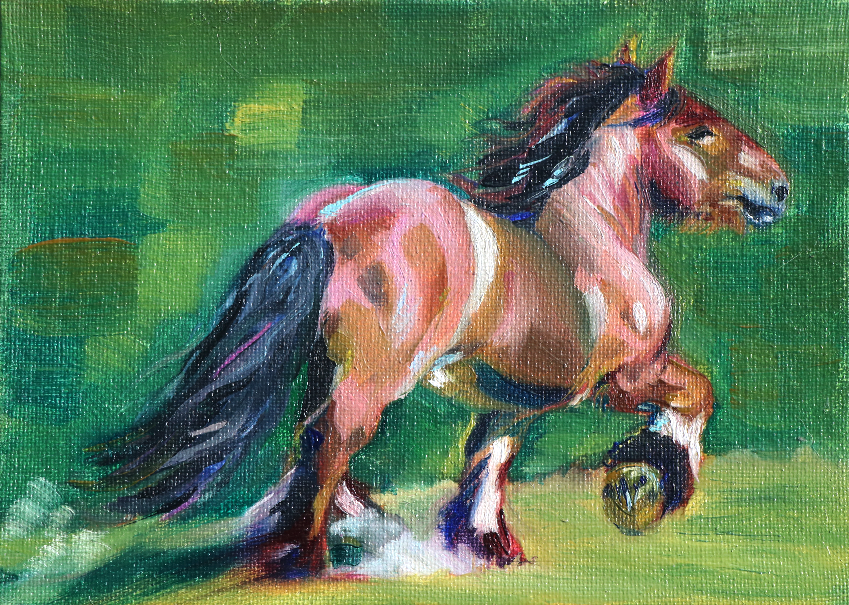
im so pleased with this :) yay horsey
Childhood Self Portrait
i keep seeing people on the oil painting reddit paint their childhood photos and i wanted to paint my childhood photos. dug around for a while and was really amused with my block tower in the original taking clear inspiration from downtown los angeles, where my father worked at the time.
.JPEG)
i admit that i did not detail the tower enough to tell its shape yet lol. the likeness isnt that close yet either but thats ok
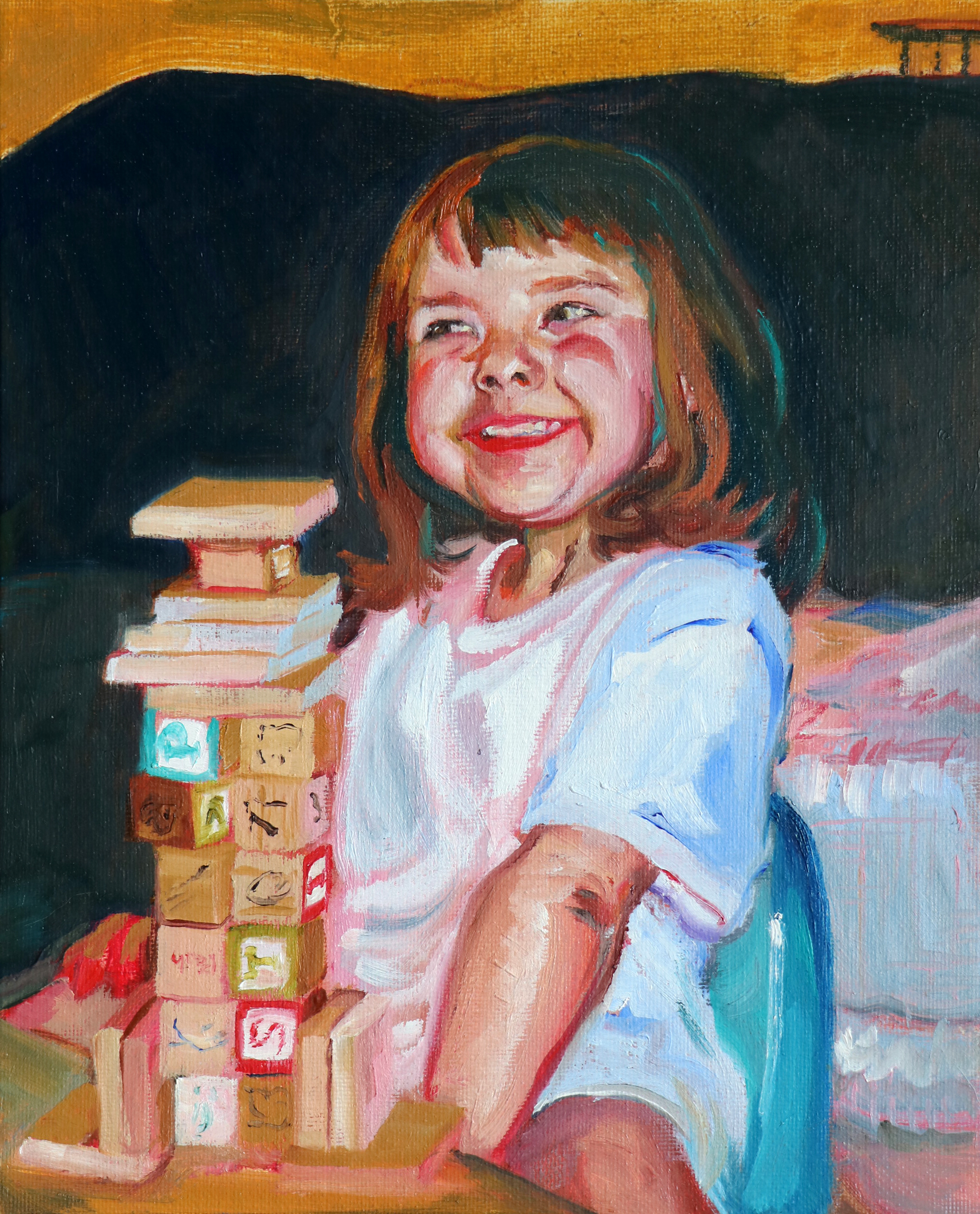
almost done here. i was gonna call it but decided ill go back to square off the blocks better and fix the hand in the background and some of the shirt folds. the likeness is as close as ill get i think it at least doesnt look more like my sister than me anymore
Nighttime Hot Tub
i walk my dogs past the pool in our neighborhood at night and i always admire the water and reflections. i saw one perfect angle one night but didnt take a picture then and i havent been able to find it again. still, i took a bunch of photos and picked one to start work on. i bought cobalt teal especially for this
.JPEG)
i ended up not wanting to work on this at that moment very quickly lol. this is my first time using a wood panel and idk if i like it.. well see on the next layer but i think this is for very detail oriented painters. ig ill try my best to be so on this
#mygourds
seasonally appropriate still lifing! dug the most interesting little gourds out of the trader joe's $1 bin and arranged them together for ostensibly more portfolio work. i always like the orange/green color combo i think i read some tumblr post a decade ago that claimed it was the most difficult color pairing to handle (i think while discussing van gogh's the night cafe) and my contrarian nature immediately wished to master it. idk abt mastery but i still use it a lot
.JPEG)
some nice gourds! that permanent orange is so juicy and bright
Apfel...
crankin more shit out lol. not super creative but not everything has to be a genius idea. bought apples mostly to paint them but i did eat them also. they are honeycrisps. yummy. even my photos of the arrangement looked painterly so i know this ones gonna be good
.JPEG)
the apples look great to me mostly (if a little too round and peach-ly) but i didn't squint enough while laying down the color of the bag. ah well i'll fix it on the next layer
.JPEG)
lookin pretty good! i think i want another layer on the bag but maybe the apples are done
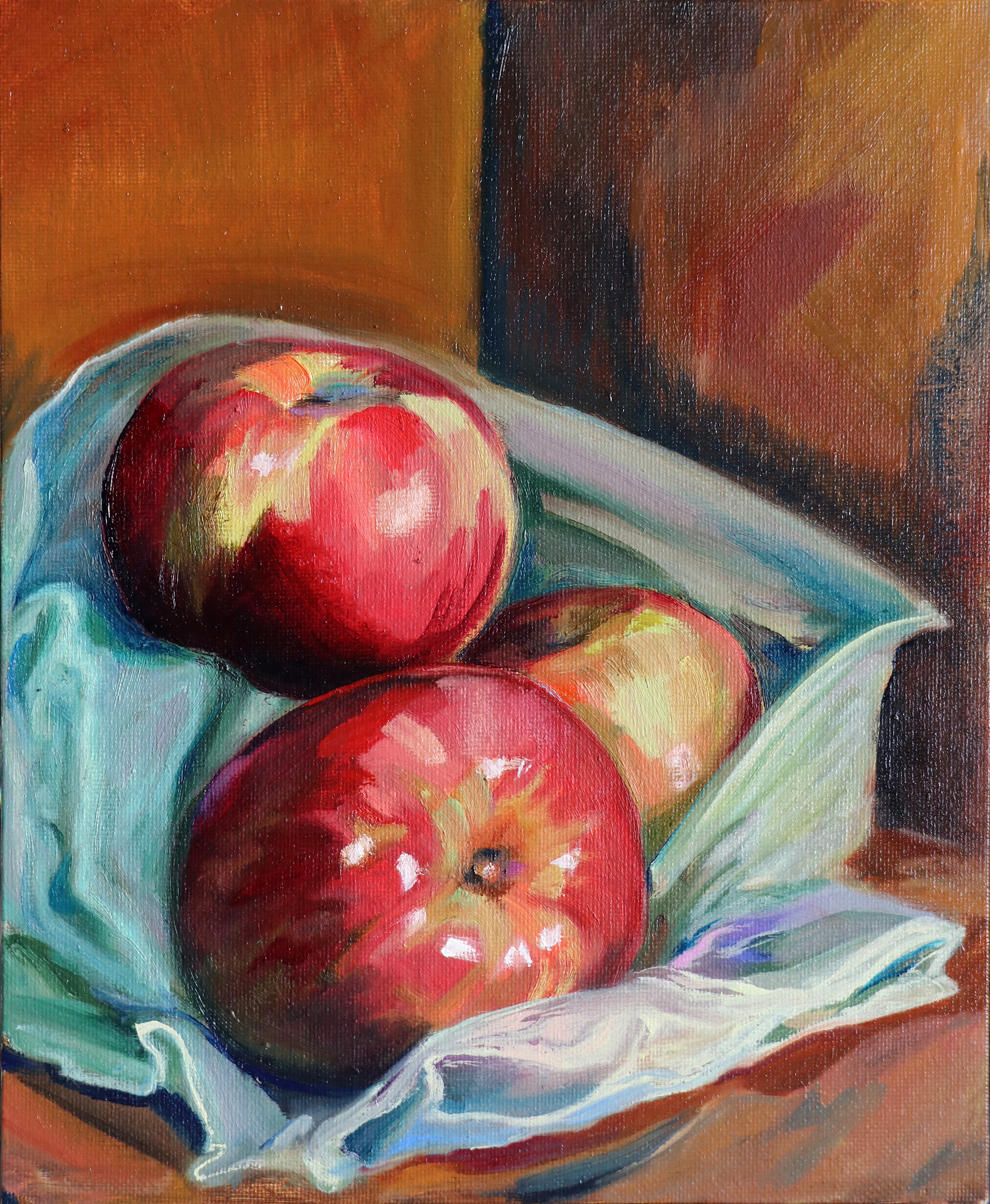
callin it here! looks pretty good to me
Zorn Palette(ish) Figure Study
more portfolio stuff :P the zorn palette is a historical set of colors used by anders zorn in many of his portraits, made up of yellow ochre, vermilion, ivory black, and lead white. lead white is poisonous and i switched in my napthol red for vermilion instead of the typical cadmium red swap but it worked pretty well! you can get an impressive range of skin tones out of these four colors so it really does excel for portraiture, but the lack of blue and green stings me. good exercise anyway! this was also my first successful alla prima <3 done in 3 hours! wet on wet is hard man. photo reference unfortunately from a deleted user on the r/drawmensfw reddit
.JPEG)
i really really like this actually hehe i kept looking at my pictures of it on my phone feeling impressed with myself. you guys i think i might be good at painting
Monochrome
i'm signing up for a college painting class in the spring and making a portfolio to prove i don't need to take the 101. like clearly i know how to paint. i went through a bunch of various painting 101 syllabi to find what's often taught in it, monochromes were a common assignment! i picked out some random items as usual, another cat figurine from my grandma's house, a jar i got at the goodwill bins that needs repainting but it has molded strawberries on it, a couple bottles of nail polish idk why they just were the right size, and a mesh reusable grocery bag for texture. this is done in ultramarine, ivory black, and white, plus the sepia oil pastel i sketched it in with
.JPEG)
i have to fix the neck of the jar lol but for the most part i quite like this. i'm happy with this composition too i like the crossing lines. the net bag is really not easy to paint but its good to challenge myself
.JPEG)
callin it done here! i like it. its a little over highlighted but i dont care anymore
In Memory of Our Caterpillars
i did a lot of cute doodles while raising the monarch caterpillars i've been talking about on my gardening page and i wanted to paint one too! simple as. this is kinda a composite reference in the end, i wanted a fun pose for the cat but my pictures sucked and i couldn't find a good pose in online photos. i'm skimming through a few photos while i work for the different bits, we'll see how it goes!
.JPEG)
i'm quite fond of this already hehe i don't think this will take many layers. once this dries, striping time!
Trinket Shelf
i am a big maximalist (junk collector) and i have some fun shelves in my room. this one is the most visually pleasing at the moment and i wanted to paint it! it holds a little bowl i made in pottery class, a venetian jester doll i got at goodwill in ventura, a roman plinth styled candle holder i thrifted somewhere i dont remember, two cat items that hold stuff? one is a toothpick holder i think and the other is maybe a vase? i got from my grandma, a candle in a bumpy cup from the target dollar section a couple years ago, and a pretty cup from marshalls and they are all in gold and green that matches the walls. the whole big shelf is golds and greens actually but this level of it looks best lol. anyway i lit the candle for the reference photo and burnt the underside of the middle shelf a little <3 whoops
.JPEG)
first pass! i got some proportions to fix but i didnt rly want to do it subtractively so i will be back for that when this dries. i like the colors so far
.JPEG)
shapin up! i just got viridian, green gold, and permanent orange in and they are all helping out a lot here. yippee
Eight-Dollar Bouquet
trying a new kind of still life! grabbed a couple $4 flower bunches from trader joes and arranged them in a pleasing manner in this vase i had on a shelf (i think it was my sisters once and it lived on the floor in the bathroom for a long time until i washed it and put it in my room). half the flowers are pet toxic and i dont have a workspace that my cat cant get into (i work solvent-free so usually shes allowed. yeah theres cat hair embedded in everything) so i took them outside and took dslr photos to base the piece on so they stay outside and i can keep working after they wilt
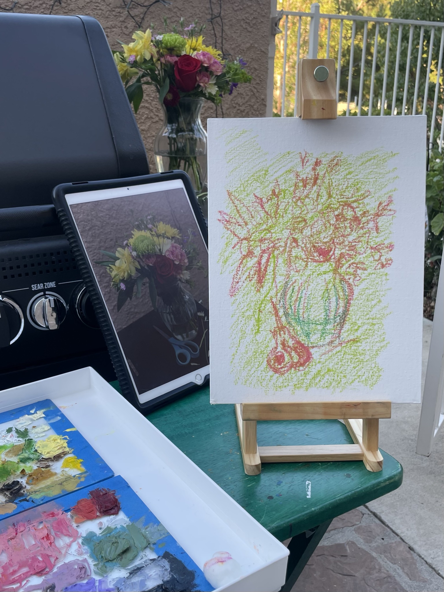
all set up outside! been using oil pastels to sketch out paintings and it works really well. i like using a bright to add a little smthn to the colors
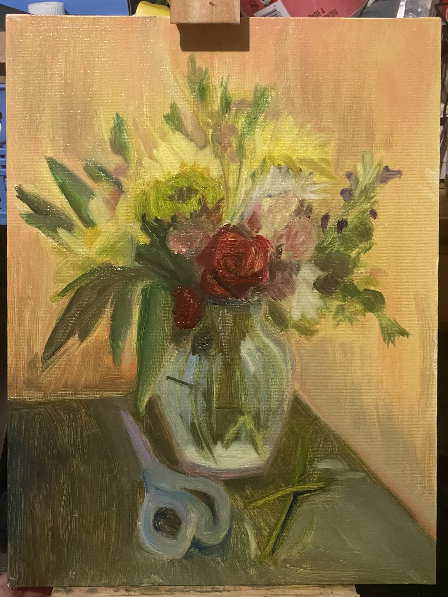
heres where i got by the end of the night. i was gonna try to do it alla prima but ig i wanna continue and refine more... this is pretty good tho huh i could pass this as finished if i felt like it
.JPEG)
second layer... lots more defined! i dont love my greens for this ive actually ordered more green pigments (havent added them to the palette since they arent in my hands yet but i got green gold and viridian) bc i dont think i can mix what i want rn. i also took pictures of the more bloomed bouquet a couple days after the original reference to get more flowers, there will be more purple! i dont think ill be keeping the table bit so blue, i was just being lazy about mixing black, but the contrast with the orange is nice
.JPEG)
my grandma liked this wip too much and now im too worried abt fucking it up to work on it much :P some improved flowers and such
I guess I'm doing a doll series
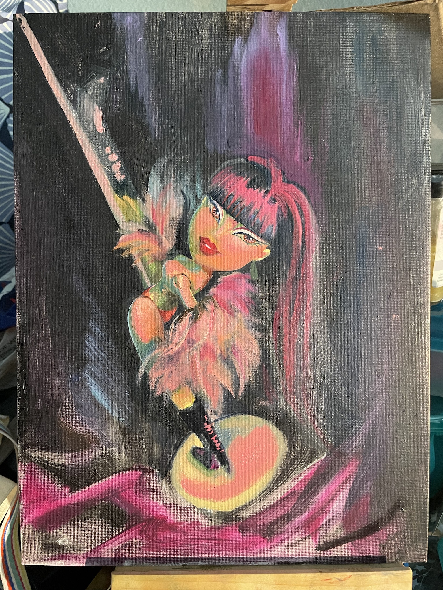
so when i was 13 i really loved the song 'sexy can i' by ray j and i was reaaally sheltered and for some reason i couldnt conceptualize the lyric 'no panties no shirt' as meaning the woman was naked on the pole (actually the reason is that my father wrote some local laws about nudity in strip clubs and other similar establishments about a year before this and he told me about the work because i used to ask about his cases to have something to talk to him about and therefore i thought fully nude strip clubs were illegal everywhere and not just in certain areas of los angeles county. yes a lot of rap music confused me back then) and i decided to try and draw my bratz doll in my idea of what the stripping outfit could be. when i finished i immediately felt such intense pubescent i-dont-know-im-gay-yet shame that i tore up the drawing and put the pieces in a cup and soaked them in water to blur the pen and mashed the wet paper up into a ball before i threw it away. all that to say this painting is me reaching back in time and telling 13 year old me that its okay i draw naked women all the time now and even get paid for it occasionally <3
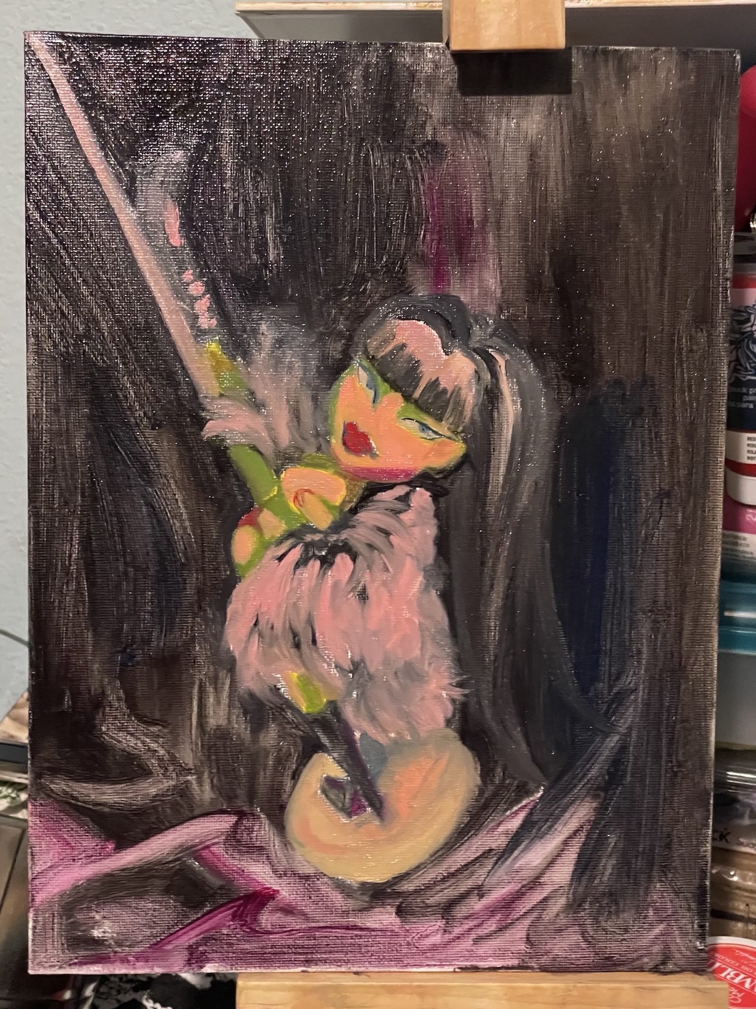
first shiny pass! a little simpsons-y at the moment but i needed the yellow base to create the luminosity of the bright red light i put on the doll setup in future layers
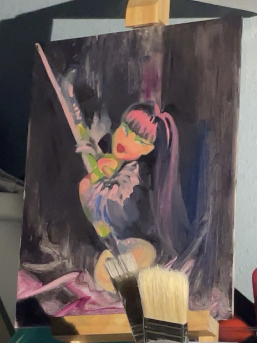
im already getting really good at forgetting to take a picture of a layer except in a snapchat from across the room that i happened to save in memories. i went and got some bright colored oil pastels to blend in bc i wasnt sure i could mix paints to the color i needed with my current pigments, but i put back the color i actually needed lol whoops. will buy that soon but i spent too much on supplies this month
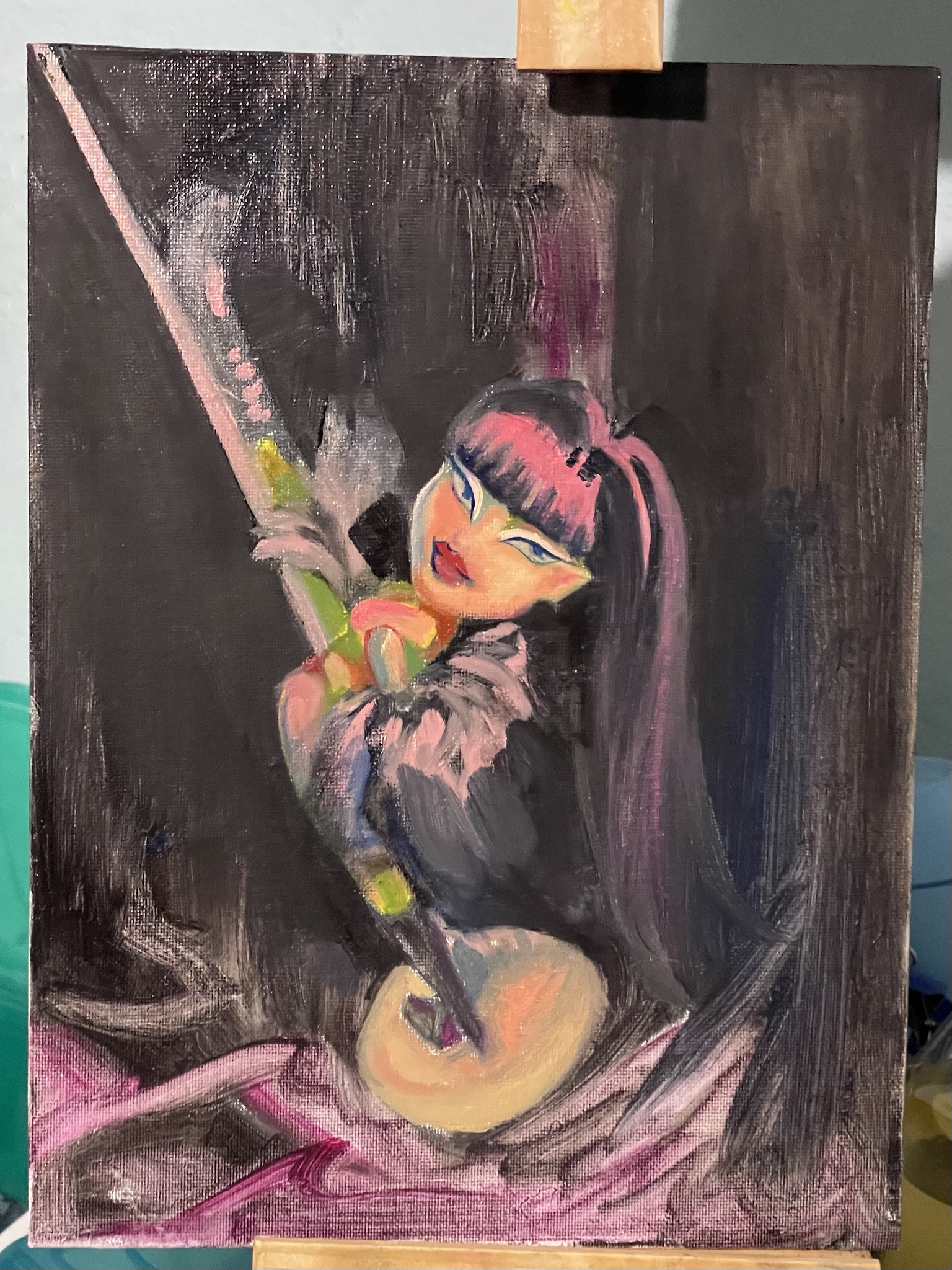
i was not very focused this session... sometimes i start painting just bc i realize my palettes skinned over and theres too much cat hair on the canvas and i need to get back to it and this was one of those. still made decent progress

now thats more like it. very happy with the brightness of the front cheek there and the arm, definitely got some other 'anatomy' tweaks to make next time
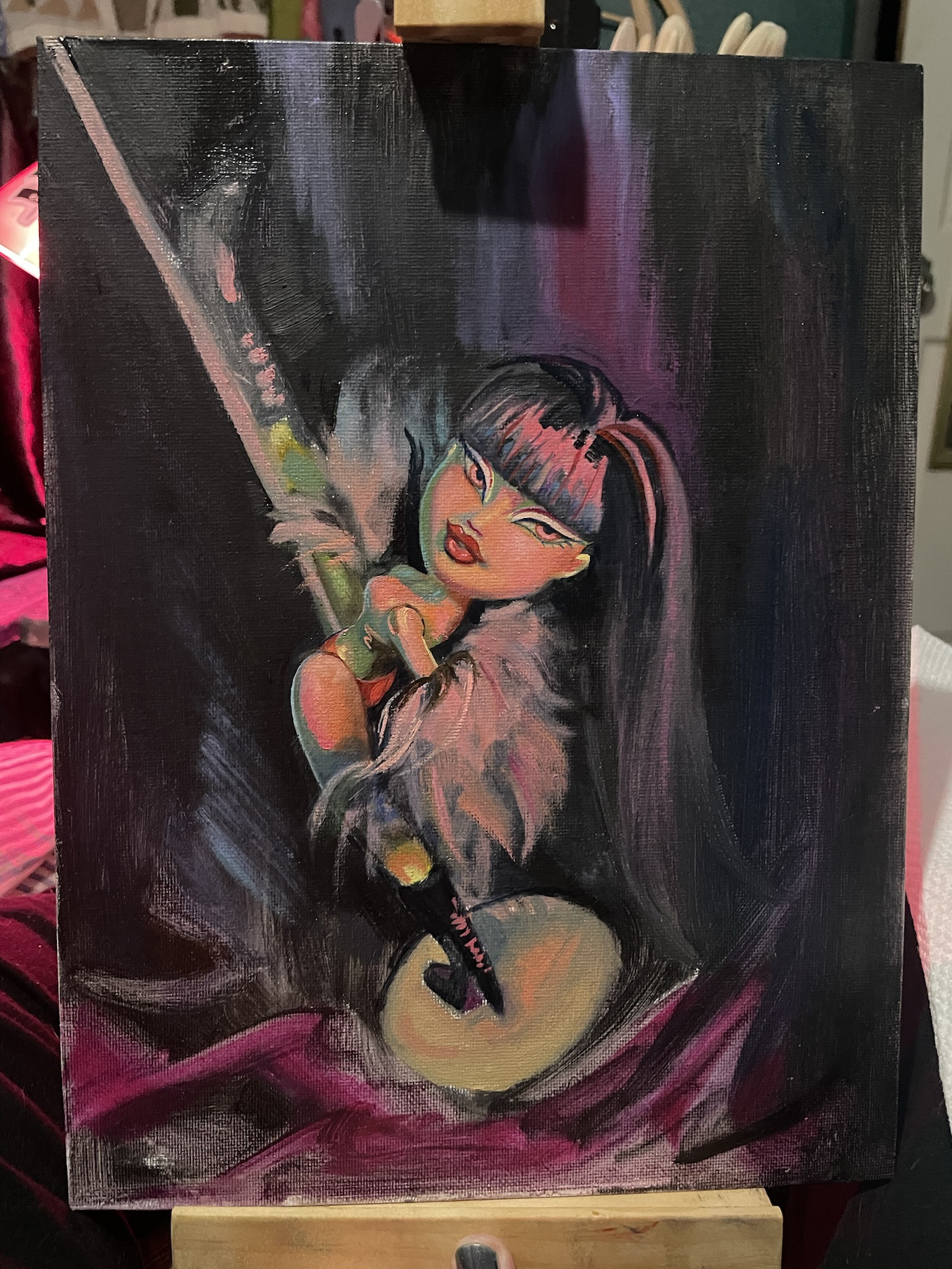
movin along! i need to scoot the lips over :P that wont be fun. i have a lot of tweaks to make here actually ugh whatever the eyes look good and yes i did move the arm i liked but i like the new one too
lips: scooted. lost a lot of face definition in the process but ill fix that once this dries down. probably time to do the background too :P my least favorite part. idk where im going with the fur coat i need to think a little harder when im doing that
.JPEG)
another pass at her back... need to redetail a lot now. i honestly just need to sit down and focus on detailing next and im procrastinating itttt but tbh id rly like to take the still life display down soon she keeps falling over so i will be doing so asap
.JPEG)
my phone is starting to not like these colors so i know i'm getting into the right neon zone lol. i think this was a pretty short session, did some fixes, got plenty more to do
.JPEG)
another layer on this before i likely neglect any personal work for the length of my painting class... started adding the quinacridone opera from holbein and this has gotten deliciously eye searing. repainted her eyes to be better proportioned. finally refining that top boot. not much to go tbh i gotta finish the bg and then i might call it good
Patio Plein Air
one of the reasons i wanted to get into oils was to do plein airs. the full on the go setup is heinously expensive to put together, so im starting on my patio where i can just sit at our old table and carry my stuff in and out in a few trips. my neighbors have nice gardens and the light is always really pretty in the evenings
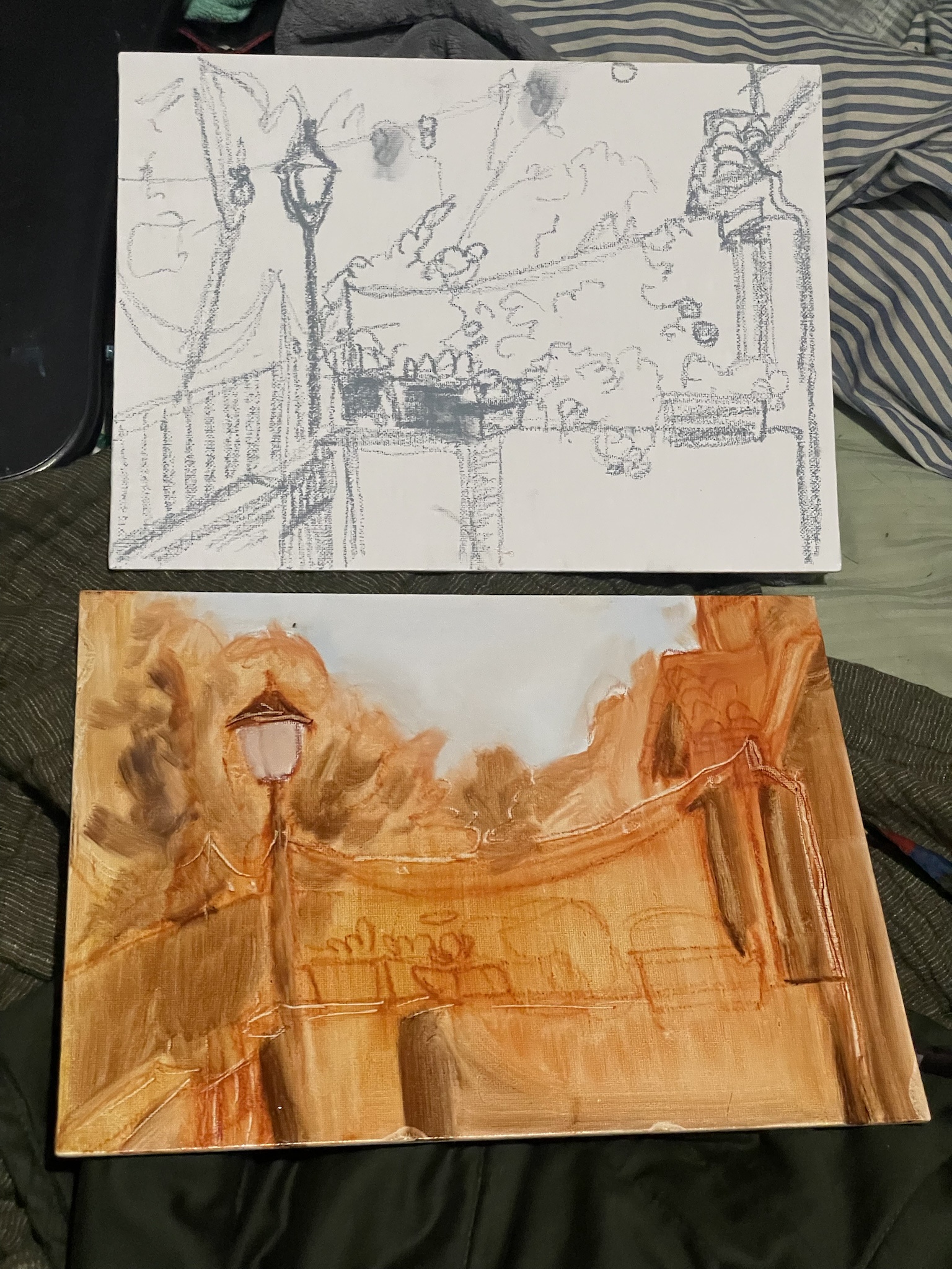
i didnt like the proportions in my first sketch so i did it again! ill paint over the other one with something else later. comparing a sketch to the washed over version i continued with
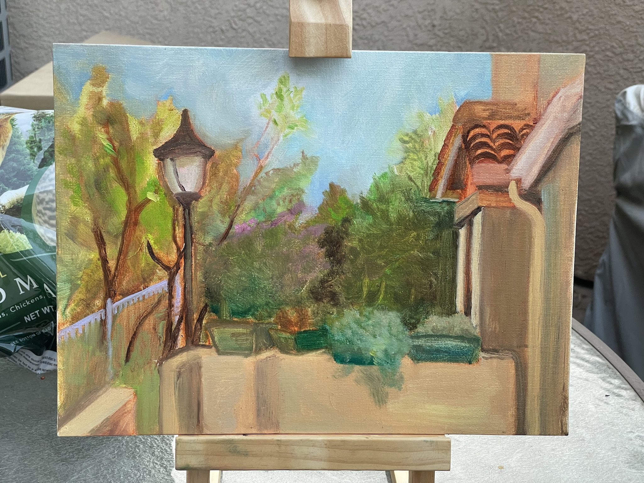
first pass of color! i couldve used my brain a little bit more when placing the foliage blocks
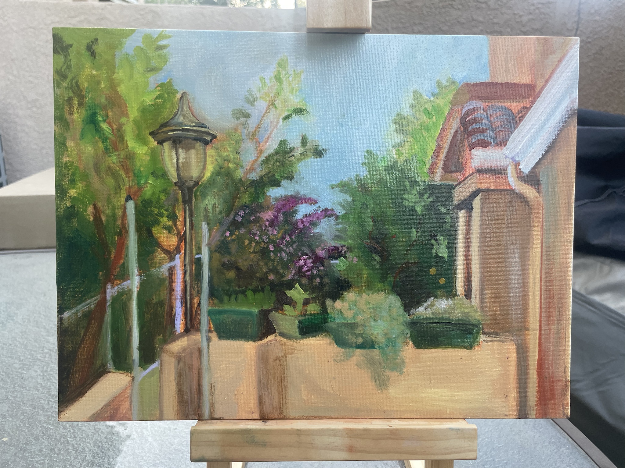
second go! i really really like how the lamp head turned out, its crazy how little you need to do to call the effect of shiny metal. decided to simplify the background a bit too
My First Painting
i guess that's a bit disingenuous of a title considering my digital background, but it's still a first! i set up a still life with a rainbow high doll and a little porcelain cat my grandma gave me when we cleaned out their house on a backdrop of one of my shirts with my multicolor lightbulb set to blue for more dramatic light and jumped right in

in the middle of the first layer! i think i was about to quit here and then realized i should get everything covered on the first pass
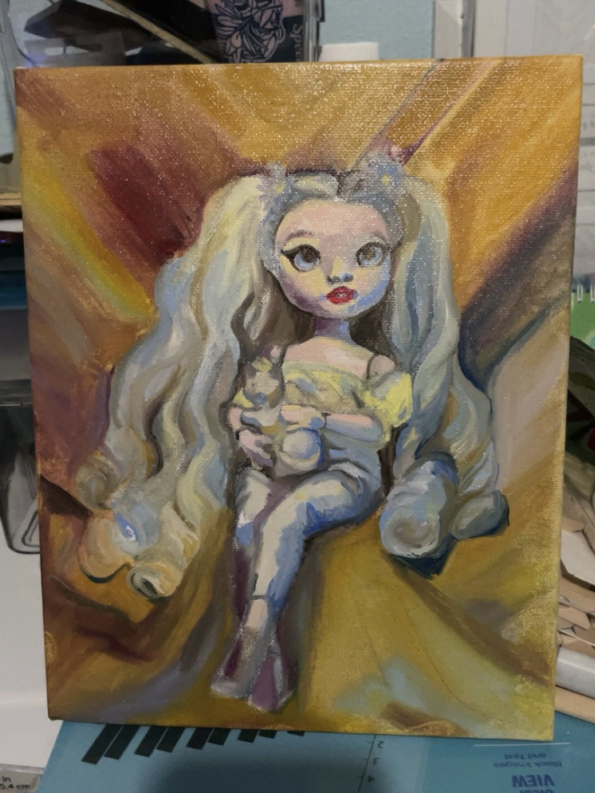
first pass all done! and extra shiny lol. this stage is always really charming to me i love her blobby little face and i felt like i did well with the colors
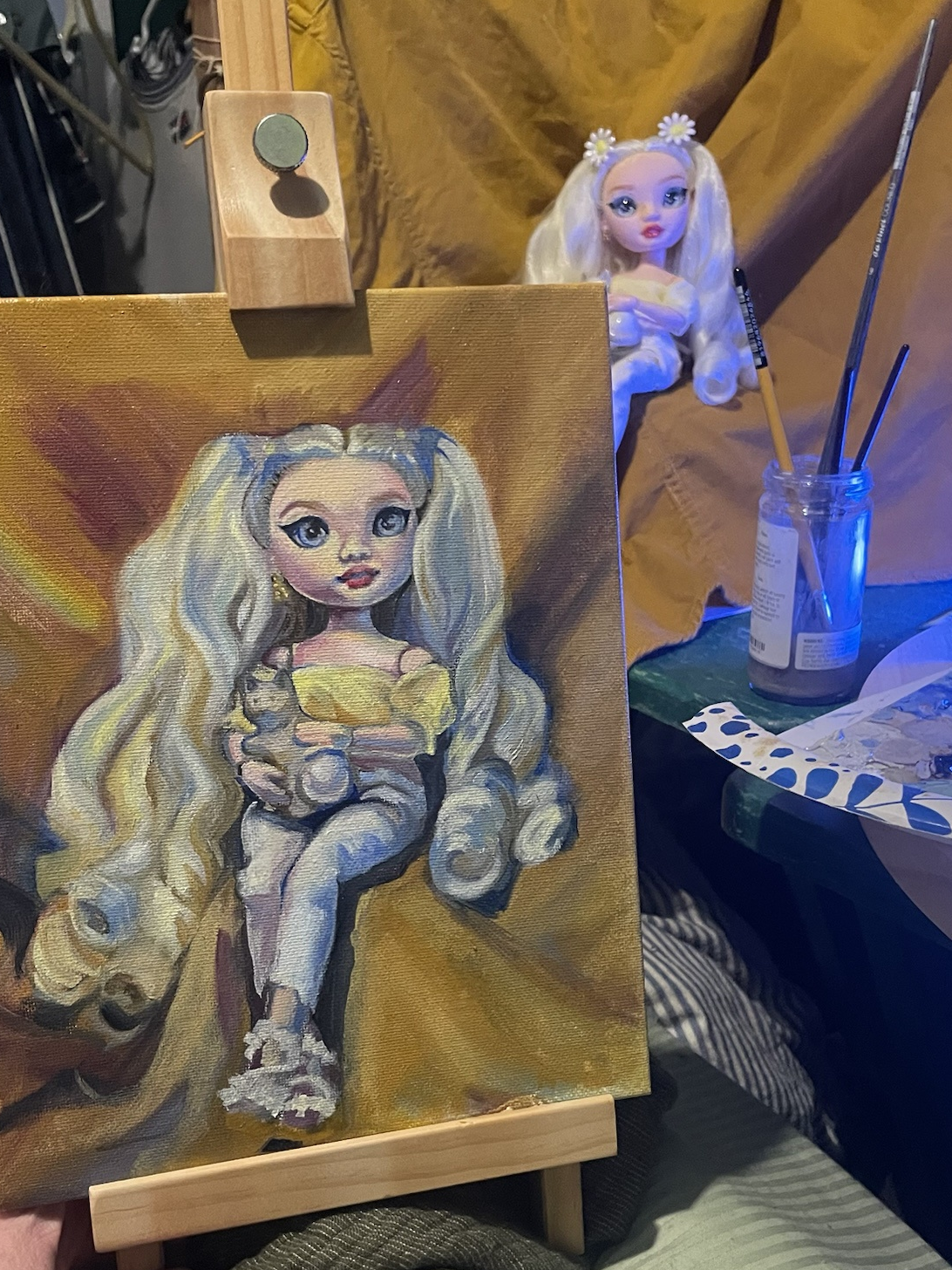
well now this one is a little scary isnt she. she really came alive in this one and not in a good way! i was focusing on adding contrast and details in this layer
i have skipped a layer of updates bc i was playing with my cat during the time the last shown layer was drying and she knocked over the still life :/ so i had to reconstruct it and it was a frustrating paint session of redoing her hair and trying to make sure my shadows mostly matched and i forgot the photo. onto this one, i do like the new hair on the left side a lot better! this is when i got the gamblin 1980 paints and added brighter blues and better purples
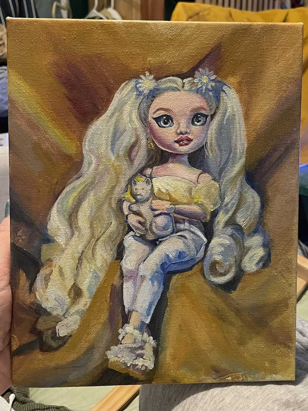
more refining away... i think this is when i decided her nose was not good and redid it because i was thinking of it too much as a nose and not the shapes of color that it needs to be. or maybe that was the next one.
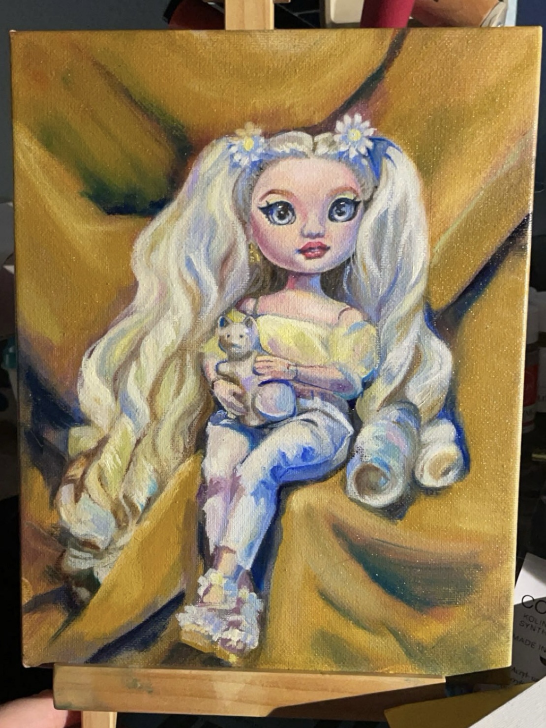
i got a little carried away blending and highlighting in some spots here lol and my paint was a little too lean for this stage but its ok. i decided to call it with the next layer (maybe 2) so next its time to go back and add contrast again. but im much happier with the background now, i feel like its really come together!
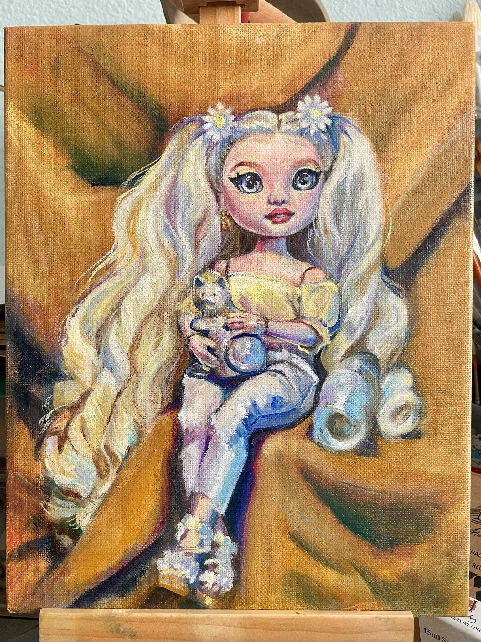
oooh shes so close to done now. i have a few little tweaks and some details i need to put over fixes i did this time but then i think thatll be all! yayyy <:) i like her!!
.JPEG)
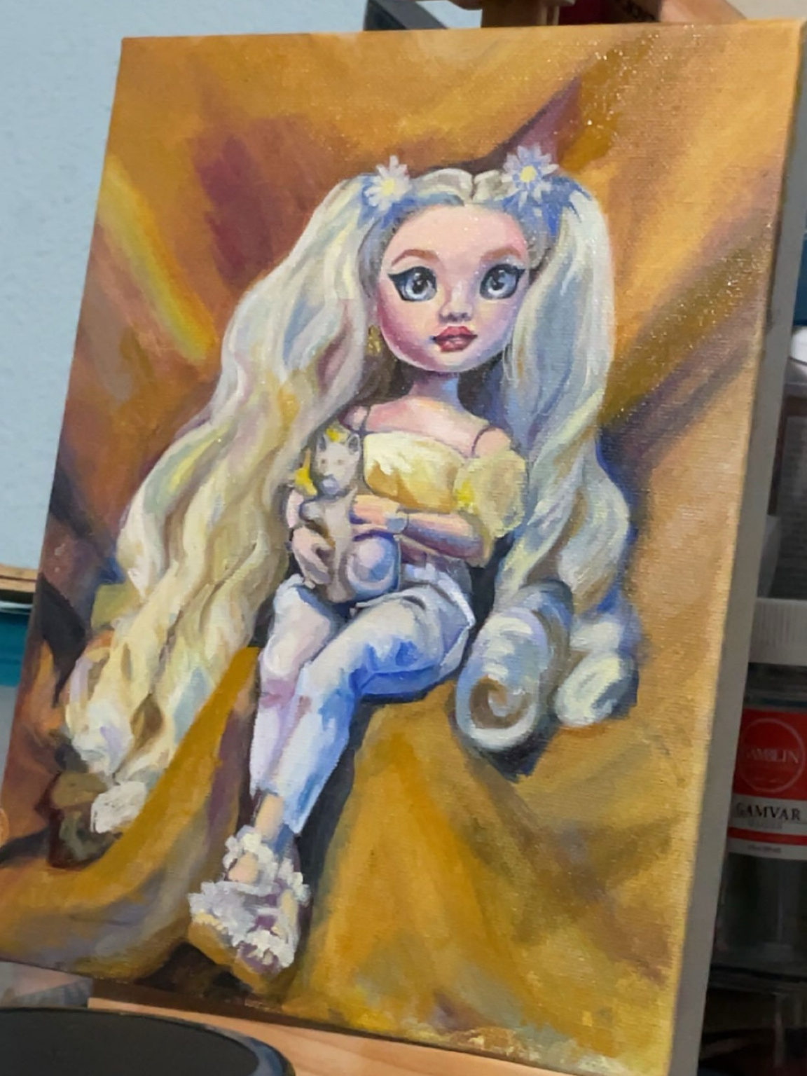
ok shes done yay!!! i had to come back to it a few times to keep fixing the eyes idk what i did for a while but it was scary. i put the brushes down the second she looked normal again and i think i rly nailed the depth effect that the actual doll has. you cant really tell in this photo but theres some shimmery accent paint i got on sale this month on her eyes and on the cat